ISL · BRAND SYSTEM
ISL Brand
Guidelines.
One brand. Used clearly. The essential rules for logo, color, typography, imagery and digital applications.

01 · LOGO
One mark. Two applications.
Use the ISL blue logo on light surfaces. On ISL blue or dark imagery, use the white version.

02 · CLEAR SPACE
Space makes the brand stronger.
Keep the logo clear of text, imagery and other marks. Until a binding print specification exists, this serves as the digital application rule.
03 · COLORS
One color carries the brand.
ISL blue is the dominant brand color. White and cool neutrals give it space. Click a swatch to copy its HEX value.
04 · TYPOGRAPHY
Bold in the message. Calm in the detail.
The website uses the system font stack. Large, tightly set headlines and highly readable body copy form the typographic identity.
Reimagined.
05 · MINIMUM SIZE
Legible. Even at small sizes.
Below a defined width the mark loses clarity. For digital use, the website-tested minimum width applies for now.
Digital use
PRINT VALUES
No invented measurements.
Millimeters, CMYK/Pantone values and binding clear-space rules will only be added when confirmed by existing ISL documentation.
06 · LOGO DON’TS
Recognition comes from consistency.
Do not decorate or reinterpret the logo. These examples show common uses to avoid.
No shadows
Keep the logo flat and clear.
Do not rotate
Keep the horizontal orientation.
Do not squeeze
Never alter the proportions.
Do not stretch
Always scale proportionally.
No off-brand colors
Use ISL blue or white.
No busy backgrounds
Protect contrast and legibility.
07 · IMAGERY
Real work. Real places.
Locations, halls, processes, people and technical infrastructure express the brand more credibly than generic business stock imagery.
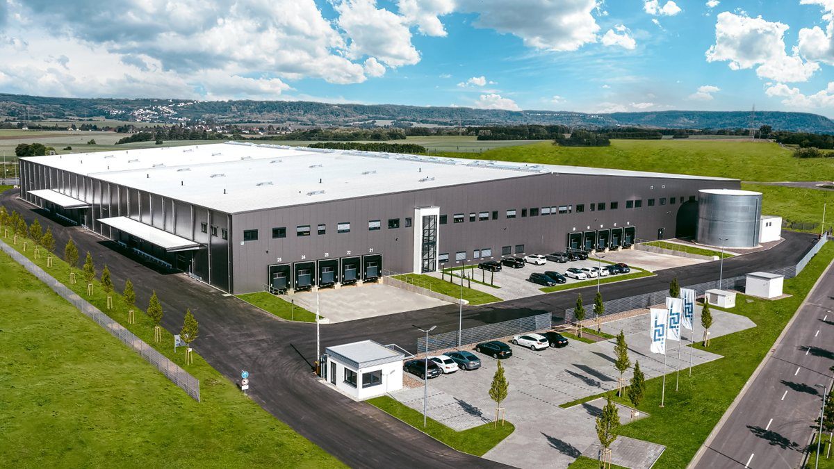
REAL PHOTOGRAPHY · INDUSTRIAL
Substance over stock aesthetics.
Real ISL imagery shows locations, processes and technical expertise directly.
08 · DIGITAL BRAND
The identity lives in the interface, too.
Pill-shaped CTAs, generous radii, fine lines and short interactions reflect the existing Modern Theme.
UI components
01 · LOCATION
Big plans? There is space.
An information layer does not automatically need a shadow or icon. Structure comes from typography and space.
MOTION
Motion stays functional.
09 · VOICE
Short. Concrete. No marketing fog.
The strongest ISL headlines make one clear statement and give it room. Fewer adjectives, more substance.
Quality.
Certified and proven.
Innovative, holistic logistics solutions for the challenges of tomorrow.
10 · DOWNLOADS